
Redesigned Dexcom UI
After hearing complaints about the app - I decided to create a solution for these issues!
CATEGORY
Implementation Resolution
TIMELINE
3 Months
TEAMS INVOLVED
Implementation
TOOLS / SKILLS
Marketing Automation
Campaign Design
User Journey Mapping
Braze, Figma
TLDR;
Designing for those in need.
Dexcom is a company that is known for it's leading technologies for Diabetes management. Their staple is called the Dexcom G7, which is a Continuous Glucose Monitoring (CGM) device. The CGM's data can be tracked through the company's app which allows users to keep track of their blood glucose levels and notifys when their blood sugar levels are either too low or high.
My reason for taking this challenge on is due to the complaints I heard about the app and as my partner has diabetes, I wanted to provide solutions that focused on user-centered approach and broaden accessibility!
The final results show how the app can be significantly improved with simple design principles and what the users actually need to see.

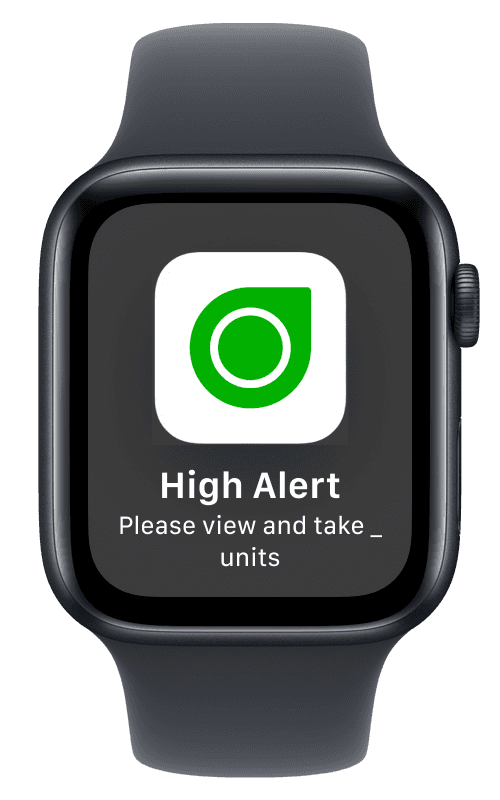

6+
Features Added
PROBLEM
Hearing from the users.
The major complaints I found from the app store and from fellow users of the app. The problems became clear:
01
Accessibility
With the surging age of technology and tailored engagement, the initial sequences were both bland and ended after 2-3 touch points. Especially for our main audience, the aesthetic-medical space, the flows or canvases had to be significantly more versatile.
02
Lack of Control for Alerts
The app does not allow you to customize the notifications with the extent of which should alert with sound and what thresholds it should use. Causes stress and frustration for people in group settings where they cannot have alerts go off during important meetings/events.
03
Deficits in Functionality
The structures for both automated re-engagement and manual reach out (Email & SMS Blasts) were not set for growth and our increasingly more complex client base. The conversion events and triggers were lacking in scalability.
USERS
I created user personas based on feedback for design clarity.
My design decisions required bridging the two major user demographics. Clarity and trust for people with diabetes and transparency and reliability for caregivers.
Persona
Person w/ Diabetes
Caregiver
Goal
View and track blood glucose levels. Access information quickly.
Keep track of how patient is doing and view history/logs. Gain insight without technical knowledge.
Pain Points
Difficult understanding data; limited accessibility.
Tedious to navigate and gather important information.
Needs
Safe and simple interface to know their next decision.
Accurate readings, easy exports, and view trends.
PROCESS
My approach!
Identify
Ran UX testing in the dexcom app to gather personal data
Gathered user feedback from interviews and reviews on app store
Ideate & Test
Explored multiple mobile apps revolving around health KPIs
Tested layout low-fi mockups in Figma
Align & Iterate
Showcased wireframes to certain users for feedback
Reviewed Brief to ensure design decisions synergize with product vision
Finalize & Present
Presented final designs to users and annotated in Figma for ease in dev-hand off
RESEARCHING!
Gathering the data and identify trends.
I studied various health tracking apps (Apple & Samsung's Health apps, myFitnessPal, Dexcom itself) with the focus of labelling key data points for users.
For further context, I reviewed apps with a dashboard interface for layout references (TD bank app, SunLife Insurance portal).
To finalize the research phase, I used AI design tools (Figma Make, Lovable) to create what they would believe would be a good solution. This helped significantly in identifying what would and would not be feasible from a design standpoint.


Findings:
Combine data presentation with empathy, avoid clutter, and reinforce trust for users.
Testing Early Versions w/ Google Stitch
Google Stitch is an AI-Prototyping tool I used to seamlessly create prototypes of the redesign based on a few simple frames I made so far. What I love about Google Stitch is that it provides a UI Kit first so I can cross reference what design system was used to create the prototypes.
Instantly generating the prototypes aided my goal as it gave me good insight of how I'd like the screens to look - saving me time instead of pondering the whole time. The prompt I used was:
"I've provided screenshots of a mobile app for monitoring Blood Glucose levels. Envision yourself as a world-class designer and take these mock ups and create high fidelity prototypes that follow the established colours and typography as seen in the screenshots. Avoid simple and basic designs. Focus on ease-of-use and stats that a person with diabetes would want to see on a screen."

v1.0 Prototype - referenced 2 of my Figma Designs as screenshots inputted into the prompt.

First draft of the glucose app - did not want to set too many conditions to have a raw idea of what Google Stitch would come up with! It's all about testing and re-iterating with design (especially AI-empowered design).
DESIGN DECISIONS
Improved UI & Navigation
Goal: asd
Solution: asd

Impact:
Combine data presentation with empathy, avoid clutter, and reinforce trust for users.
DESIGN DECISION #2
Empowering Notifications for flexibility and clarity.
Goal: asd
Solution: asd
Impact:
Combine data presentation with empathy, avoid clutter, and reinforce trust for users.
DESIGN DECISION #3
Adding in Proper Apple Watch and iPhone Widgets
Goal: asd
Solution: asd
Impact:
Combine data presentation with empathy, avoid clutter, and reinforce trust for users.

© Built & Designed by Ammar Ul Haque, 2026